scripts
Blocking Scripts
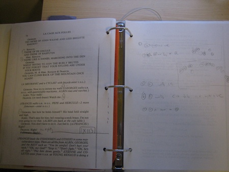
A better page is coming someday, but for now here's a page of my blocking script from La Cage. Characters are represented with single letters, ensemble are usually their initials. Keep in mind this is summer stock. It ain't pretty.

Calling Scripts
I'm totally fine with a handwritten calling script for summer stock and other short runs, but for a show that runs long enough, I do my typed calling scripts in Word.
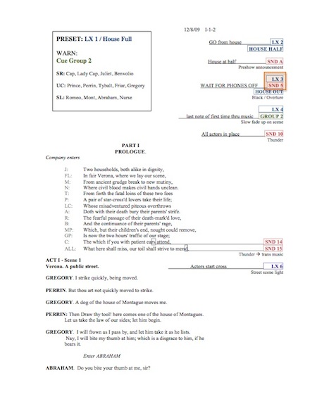
If you want to take a look at it, you can download my script for The Acting Company's 2010-2011 tour of Romeo and Juliet in .doc format. I hope the margins will come out correctly for you (Word always seems really unreliable that way across different computers). If not, and you just want to see how the script is laid out, here's a PDF.

Calling Script FAQ
How Do You Place The Cues in the Script?
To keep the cues moving smoothly with the text as it changes, I write the cues inline with the text and then highlight the cue name/number and put a border around it. Then I underline the space between the cue and where it goes in the text. Wherever there's a cue I have to change the margin to be wider than the rest of the text. You could also do this by manually placing carriage returns in the whole script, but I like my method because for the most part it doesn't fall apart if the text needs to be updated. This seems easier to me than dealing with text boxes and stuff, which always wind up where you don't want them. There are very few exceptions to this where I do use a text box for additional information, but not for actual cues and warnings.
Why the Different Colors?
My brain sometimes does strange things. I have found that doing shows with lots of different types of cues, sometimes the color being different is the last line of defense before I do something stupid. Other people may not benefit from it, but I have been saved by it many times. The color assignments here are kind of arbitrary, and not necessarily the colors I use on other scripts. I was playing around with using non-primary colors, which I kind of like. I do find that when the color temperature on my script light is too warm, the red for the sound cues sometimes becomes a little too faded for my taste.
What is that Crazy Orange Box?
That's kind of a new thing. I use my stage management database to track running times. On the performance report there is a button next to the start and end times for each act, which records the time when it's pressed. The cues surrounded in the orange box are the ones that I need to hit the mouse button with, basically the official starts and ends of each act. I got tired of having to think so hard about it every time, and decided to highlight it so I could take my mind off it.
Handwritten Calling Script - Musical
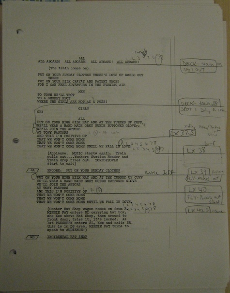
A page from "Put On Your Sunday Clothes" from Hello, Dolly!.

Let's see, where to start. This is a page I recall being crazy, although it actually doesn't look that crazy. It was just a lot of big scenery that took a lot of concentration and anticipation (and luck) to get in on time. Also, I have heard it said, "An easy show is one in which you can't kill people." This particular number (actually it was on the previous page) also featured a flying railway arch piece with pillars which came to the floor as the ensemble paraded around it. If it wasn't timed properly and flown at the proper speed, either people would be under it, or it would be obviously, terribly late. There was a very small window in which it would be correct. And just as I was recovering from the outcome of that, this page happened.
The cues we have here (aside from lights) are:
- a deck move of the train on (which was a 2D steam locomotive with I believe a single car behind it. It was pushed from the back by several carpenters, and took a good few seconds to get going from the time the cue was called).
- move of the train off (which also included a steam effect created with a fire extinguisher)
- spot pickup on Dolly at the back of the train (in frames 1 & 6 which is written here just in case the operator needs to double-check, but it's only said in the warning).
- fly cue of the arches going out (Jeff is the conductor)
- fly cue of the Yonkers backdrop going out (slow)
This is pretty much the format I use for handwritten calling scripts. All the cues in a box, and the warnings and standbys between. With a fast-moving scene sometimes I place the cues a little differently just to make them easier to find when reading along.
You can see LX37.5 kind of hanging out a little to the left of the others. I think that was just because it was added late, after the standby was already there. It's easier to read the way it is than to squish the standby. You can also see the train off cue was originally in line with where it's written but was moved later.
The first cue on the page (the train coming on) has the musical count with both an arrow and a circle. Generally the circle is where the cue should be called, but sometimes when teching a show (or just trying something new) I will jot an arrow where I'm trying a cue, so I can compare later, and make adjustments the next time based on how it turned out from calling it there. In this case it was me moving the cue earlier to account for how long it took the train to get moving.

