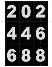
If you’ve perused the Templates page before, you may have seen my quick-and-dirty number line PDF. They’re big black numbers on a white background, with guide lines to cut out and little tick marks to show you the exact center of the number. I originally created them for situations where you’re in a rehearsal space that doesn’t have a permanent number line. You can laminate them if you want them to last, or if you show up on the first day (or the first day of choreography) and you’re like, “Oh shit, we forgot to make a number line!” or “Oh shit, the people in the room last night destroyed our number line!” you can pull up this PDF and hit “print” and throw them down in just a few minutes. They may not last more than a day, but it’s great for emergencies. I keep one laminated set and one or two emergency sets in my kit at all times.
However, as I said, they’re big and white and ugly — designed to be readable from anywhere — which is not what you would want if you were actually putting them onstage for performances. For most stages, fancier stickers looks a whole lot better. But what if you can’t get fancy stickers, or someone got you stickers but they’re not fancy enough, and you’re five hours from having an audience?
When I did White Christmas last year we had the double problem of needing a more discrete downstage number line than the stickers we had available, as well as an upstage number line (which is occasionally requested if you’re doing a real dancey-dancey show). The upstage line is even trickier, because while the audience sometimes can’t see the downstage line due to the angle, a slight lip to the stage, or footlights, mics and other gack along the perimeter, the upstage line is unobstructed and especially anyone in the balcony is going to be looking right at the symmetrically-spaced marks every two feet.
We decided we needed more specific control over how the numbers looked, so I altered my original number line to our specifications. First of all we didn’t want the big white box around the numbers. Instead of doing white on black, we did light gray on black to make it a little subtler. We even did medium gray on black, intending to use it for the upstage line, but when we laid both down on the floor for the very scientific “hey can you guys see this?” test, the dancers voted for the lighter gray for both. If you want the numbers to be a little smaller for added subtlety, you can print the PDF at 90% or whatever you prefer.
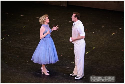
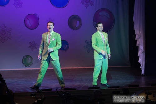
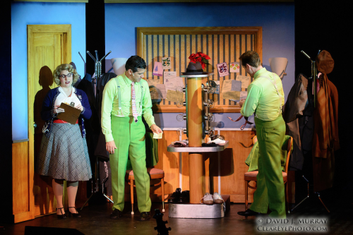
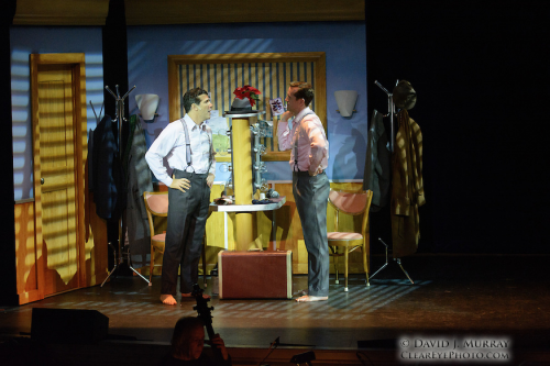
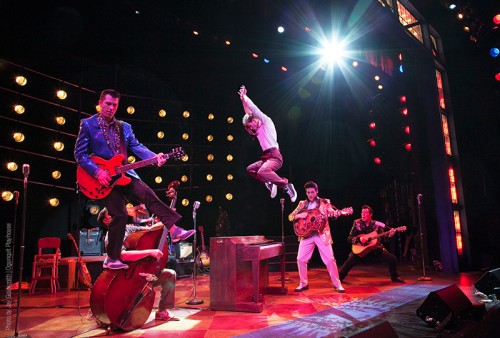
The finished product is visible enough to be read onstage, but relatively subtle from the audience (or as subtle as having numbers all across your stage can be). This production photo shows the stage right half of the line pretty clearly.
