HOME

August 17, 2007

iWork 08 Review – Pages

I call this: computers,mac — Posted by KP @ 10:25 am

While in the five years since I switched to Mac I have grown to love Apple’s style of hardware and software that “just works,” I still like to know that I have control over the way things work and can customize them to my liking. For the most part I haven’t felt that being a Mac user has taken away my ability to customize, but sometimes that means replacing Apple’s built-in apps with 3rd party replacements. Missing Sync instead of iSync, Firefox instead of Safari, and the biggest of all, Office.

I have tried. I have no love for Microsoft, and their Office apps are buggy and slow, especially because they just don’t seem to have gotten around to updating their software for Intel processors like, oh, I don’t know, pretty much every other Mac developer on earth. But still, I don’t seem to be able to tear myself away from Office. But with each release of iWork, I try again.

When Apple first released Pages, I was excited to see what it could do. I became frustrated very quickly. With Word, even when I don’t know exactly where to find a certain function, I usually instinctively look in the right general direction. Every time I try to use Pages I find myself searching the whole app, in menus, preferences, the Inspector, contextual menus, all the while wondering if I’m even going to recognize the name of the option when I find it. And when I do find it, it’s usually somewhere that makes no sense to me and took way too many clicks to get to. I just don’t like the layout of these kind of Apple apps with the Inspector, and the giant Font menu that pops up and gets all in the way just to make a simple change. Having this in an app as important as a word processor was driving me crazy. I never realized how much I’m tied to the Microsoft way of doing things, although it makes perfect sense since I’ve been using MS word processors exclusively pretty much every day since the age of nine. There are certain things I just expect in the UI and the menus, and can’t conceive of doing any other way. Knowing that Apple is often right about these things, I keep trying to get used to their way, but every previous attempt has sent me quickly back to Word.

I worked with a director last year who did everything in Pages 2, and his stuff looked great, and I made another effort to force myself to use it, but when I couldn’t get things to look exactly as I wanted, again I had to give up and do it in Word where I knew exactly what to do.
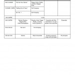
When 42nd Street started rehearsals last month, there were a lot of changes in the schedule every day, and I needed to produce new and easy-to-read schedules pretty much on the spot. Taking time to format them and make them look pretty was time we didn’t have. And they had to be easy to read as they were being made, so that we could see problems, like time overlaps or too many rehearsals scheduled in one room. Despite being in full anti-Pages mode at the time, I knew that this particular job was perfectly matched for Pages. It can look pretty, and it can look pretty immediately. I made a table, created the right number of columns, and began dragging things around to form our schedule, merging and dividing cells as needed. At right you can see an example. Stuff is just typed in without any thought to formatting, and it looks clean and legible. I would save a copy every day as a PDF to be e-mailed to the cast. Pages can also save in .doc format, but I prefer PDFs more and more as different versions of Office can screw up margins and formatting, and if the document won’t need to be edited by the recipient, I prefer the safety of knowing it will look exactly as I intended.

As the weeks went on, I came to appreciate the ease of Pages more and more, and sometimes would play around a little with settings, and got used to where to look for various options. So I was already in the right frame of mind when Steve Jobs announced the new version of iWork last week (yeah, I’m totally one of those people who sits at home following IRC chats and liveblog updates any time Jobs gives a keynote, and then watches the video of it once it’s available for download). A new version of Pages, plus a brand new (but not at all unexpected) spreadsheet app called Numbers, had me very excited. I use Keynote quite a bit in my career (as discussed here), but nothing in the new version has particularly caught my attention, it’s all been about Pages and Numbers.

The Pros

The big thing that got me all excited while watching the Stevenote was when he mentioned a contextual formatting bar. The best thing possible — all the easy-to-reach formatting goodness I miss from Word (you know, drop-down font menus, font size, alignment buttons), and contextual, to make space for only the options I need at a given moment. So exciting!

One other thing that seems to be improved is that Pages appears to be remembering my preferred settings for default documents. By default it has this maddening setting to add 12 points of blank space every time you press the enter key. It’s some sort of “paragraph break” or whatever, but I’m fully capable of hitting enter twice when I want such a thing, thank you very much. It’s nice to have a style option like that, but it drove me nuts that it was enabled by default and when I finally figured out where the hell to change it, I had to do it every time I opened a blank document. It doesn’t seem to be doing it to me anymore now, so either it’s teasing me, or it has learned that I don’t like it and will remember that from now on.

Pages has always been better than Word at page layout, and one of the new features is a separate page layout mode, which lets you start a document which is totally blank and waiting for you to add text boxes, images, etc. and you don’t have to worry about the regular typing area. It also has a feature I have long loved in Keynote: a line that shows up when you get close to aligning objects to sensible things like horizontal or vertical center of the document, or aligned with an adjacent object. It makes it really easy to arrange things perfectly. I’m not 100% sure this is new to Pages 3, but I think it is, and regardless, it’s something SO much better than Word. Have you ever tried to perfectly align an image or text box in Word? Enough said.

Office 2007 for Windows was released at the beginning of this year and it features new document formats which are supposedly smaller and better. I have been living in 2007 for eight-and-a-half months now, and have never crossed paths with one of these documents. I guess they’re slow to be adopted as many people and businesses haven’t upgraded to the new version of Office, or are using the old formats for the sake of their non-’07-using colleagues. For Mac users who need to open these documents, MS has recently made available a beta version of their conversion tool, which supposedly will be built into a future Office update… someday. In the meantime, while Office cannot presently open documents in the current Office format, there are some other apps that can. Such as Pages and Numbers. (In fairness, so can the open-source office suite OpenOffice, but it’s more fun to point out the irony that Apple’s apps are more Office-compatible than Office.)

The Cons

Two of my favorite things in word processing are tables and comments. I use tables a lot as you can see in my schedule example above. Now imagine I’m making that schedule. As I’m typing I say to myself, “do we need Julian to come to the ‘Go Into Your Dance’ rehearsal?” So now I want to put one of Pages’ oh-so-sexy comments pointing to the cell for that rehearsal and say something like “Julian?” Problem. A comment attached to a table attaches to the entire table, it can’t be used to indicate a particular cell. Bummer. It was a bummer last year when I was trying to get into Pages, and it’s a bummer in this version. In fact, in trying to test this, I find I can’t even get a comment onto a table at all in word processing mode, only in page layout. Not sure what’s up with that.

In Summary

I think the new version of Pages includes enough of the features I want to finally get me over my Word withdrawal so that I might actually be able to make the switch. When I’m old and gray and Office 2008 eventually comes out, I may have to still buy it just in case, but that’s still a long time away. If I can get Word and Excel out of my life, I will look again at getting rid of Entourage, but e-mail and PIM functions are the most important data I work with, and I find Mail + iCal + Address Book very weak in comparison to the power of Entourage. Thankfully, Entourage can be purchased separately if it comes to that. I look forward to seeing what happens to those three built-in apps in Leopard, maybe they will come closer to what I want, and I won’t need to spend hundreds of dollars on Office anymore.

A review of Numbers will be coming soon!


June 13, 2007

Projections for Theatre Using Keynote

I call this: computers,mac,summer stock,theatre — Posted by KP @ 8:03 pm

Quite by accident, I have become something of an expert on the use of Apple’s Keynote presentation software for running projections for professional theatre. Since I’m currently in the midst of one of these shows right now, I thought it would be a good time to take a look at how it’s done.

To start at the beginning, you must know about the show that gave me my first experience with Keynote. At the time (2003), I had recently switched to Mac, and owned a Power Mac desktop, and my former computer which was an 8-lb. Dell laptop. By this point I knew I could never go back to using Windows to get any real work done, and I accepted that if I ever got a tour, I would have to buy a Powerbook. This was at the end of the product life of the Titanium Powerbook, and I was hoping if such a thing ever happened, that Apple had a better 15″ model up their sleeve. In the late summer, the 15″ Aluminum Powerbook was released, and I breathed a sigh of relief. Even more so when only a few weeks later I got called to interview for PSM of a small tour. A few days after that, the producer called to offer me the job. I literally hung up the phone, grabbed my keys, and ran to the Apple Store.

With my shiny new Powerbook, I began rehearsals. This show had a really large projection component, both still images and video, and they were not just decorative. The actors interacted with and referenced the images throughout the show, and any errors would make the show not make sense. The video designer was happy to see I had a Powerbook, because he intended to use the then-new Keynote app to run the show. The fact that I owned a Mac laptop simplified things greatly, and I was more than happy to offer its services, since it gave me the opportunity to tinker with my new toy, and a free copy of Keynote to boot. I learned a lot from our designer as he experimented with the slides and played with various features. I had to become pretty proficient with it, because he would not be traveling on the tour, and as the show was still going to be undergoing changes, I would have to be able to handle most situations that would come up. The only thing he would do was editing of the videos and images themselves, which would then be FedExed on a DVD to whatever theatre we were at, and it was up to me to create the slides around them and the transitions between each one to fit the needs of the show.

Sometimes I would be asked ten minutes before a performance to add or remove a border around all the images, or to move or crop all the images in some way, or to swap or reorder them. I think at its peak the show had about 70 projection cues, and I’m not kidding when I say I was asked ten minutes before a show to make changes to all of them. I got very fast with Keynote, and much of the credit has to be given to the intuitive drag-and-drop interface and that magical way Mac apps have of answering all your wishes when you say, “I wonder if I can do this.” This was only version 1 of Keynote, and it has only gotten more stable and flexible through version 2 and now 3. One huge complaint I had on that tour was that the display on my computer while I was running the show did not give me any helpful information about my presentation that I couldn’t already see on the screen. Even the column of thumbnails on the side didn’t scroll as the slideshow progressed, so once you reached beyond the first ten or so, you didn’t even know what was coming next.

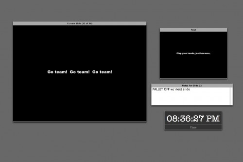
Nowadays, when I’m running a show my screen looks like this:

You can choose which elements to include on the screen, where to place them, and resize the current and next slide displays. I like this layout because it places the emphasis on what’s on stage so I don’t get confused, but also gives me a good idea of the cue I’m about to go into.

This is from my file for Thoroughly Modern Millie, which I’m proud to say has since been used in productions in North Carolina and California, and I even got paid! The only projections in that show are supertitles, but there’s a ton of them (90, including the blank slides for when nothing is supposed to be seen), as they are used to translate for the two Chinese characters. It was one of the greater challenges of my career to be displaying Chinese translations in real time while also calling the rest of the show. You can see I’ve used the notes field in this slide as a substitute for my calling script. During the Chinese sections I literally couldn’t look down for the entire scene, because each slide only shows a few words and I had to make sure I was on the right one for what they were saying. I don’t speak Chinese, but I did learn all the dialogue in the show. Having that notes field conveniently placed made it possible for me to keep my head up watching the screen and the actors, while being able to get a quick reminder so I could call cues and give warnings and standbys without the script.

The clock of course is handy for noting the running time of the show.

On the tour I first used Keynote on, it was part of the deal that each theatre supplied the projector. We had to deal with whatever they had, and I was prepared to hook up to any kind of connector: DVI, VGA, BNC, RCA, or S-Video. The Powerbook has a DVI and S-video port, and all the others could be done with adapters that I carried. BNC could sometimes be problematic because the signal had to go through two adapters: S-video out to RCA and RCA to BNC. The digital formats (DVI and VGA) tended to be the best, but sometime depending on the projector and the theatre the analog actually worked better. This is why I got good at setting up and breaking down the whole shebang very quickly. I could walk into a theatre for the first time and be pointed to the projector with my laptop and a couple adapters and have video running in probably two minutes. Hours and hours and hours would sometimes be spent if there were problems with the projection angle, bulb brightness, height of the ceiling, etc. but getting the show coming out the lens was the easy part.

One of the tough things about doing shows with devices like DVD players and VCRs is that if it’s not a Broadway show using professional equipment, consumer models have a tendency to display things you don’t want an audience to see, like big letters that say PAUSE coming up between cues. The solution to this is usually some sort of physical device that blocks the lens between cues, but this is often impractical, especially when the projector is hung in the air over the audience. The beauty of using the computer is that you can project a black screen between cues, even if you have to exit the presentation. How to do this is not always obvious. When I offer my services to a show, the question I always get is, “But how will you be able to run it without the audience seeing your desktop?” People really don’t believe it can be done. When you’ve done it a few hundred times, it’s ridiculously easy.

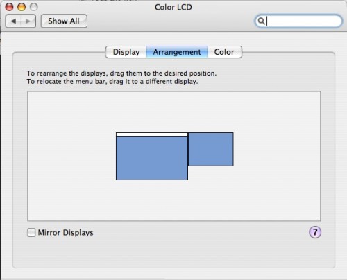
Several steps: you want to turn off display mirroring. In System Prefs/Displays, under the Arrangement tab, you will see a checkbox called Mirror Displays. Uncheck it. I discovered when trying to help the folks at Reagle do this for one of their winter shows that iBooks have their graphics card’s mirroring capability disabled. There is apparently a hack (Google for screenspanningdoctor), but they didn’t try it because it’s not particularly safe. I’m not sure if this is still the case with Macbooks.

When you have mirroring off, imagine the projector is a second monitor attached to one side of your screen. You’ll see something like this.

You can drag the second screen around wherever you want, I always keep it to the upper right as shown. Wherever you put it, the contents of the projection screen will exist in that direction off your desktop. If I’m clumsy and slide my mouse off to the right, you will see it on the projector. There’s nothing wrong with having to back out of the presentation to fix something during a show, the only danger is accidentally flicking the mouse off your laptop into that area leading to the other screen.

Also notice there’s a little white border at the top of the center screen. This represents your primary display, in the shape of the Mac menu bar. Whichever screen you drag that white bar to is the one which holds your menu bar, dock, and by default your desktop icons. You do not want this on your projector. If somehow it winds up there, just drag the white bar back to the other display.

Now you have two screens: your regular one on the computer, and the other, rather empty one on the projector. By default, your desktop wallpaper will probably end up on the projector as well. This is probably not what you want. I have an image in my wallpaper folder that is all black. It’s called BLACK so it’s easy to find. When you go to System Prefs and select Desktop and Screen Saver, you will get a window on both your computer and the projector’s screen. The cool thing is that using the window on the projector, you can sets its wallpaper independently of your normal desktop. So I have the projector set to BLACK, but I can keep my favorite desktop wallpaper on my computer. You should only have to do this once, after that the computer will remember to assign the black desktop to the projector. Unless you make the mistake I made this afternoon, when I plugged the cable in to my computer before turning on the projector. Apparently this confuses the computer, for it set my desktop resolution to 800×600 or something, forgot the wallpaper, and had mirroring turned on. I will remember not to do that again.

Another word of advice: whenever possible, focus the projector on a nice projection surface before you try to do anything with your desktop settings. It never seems to work this way for me, I always wind up trying to manipulate the windows while the projector is throwing an out-of-focus, backwards, horribly-keystoned, and way-too-far-away-to-read image across the ceiling, proscenium and several layers of set pieces. It can take several minutes just to find the mouse pointer. You have to know the desktop prefs window pretty well to be able to set it under those conditions.

When doing a show I do like to keep the desktop settings icon on the menu bar for quick access, especially for shows with analog connections, because the display will not be detected automatically, so you have to select “Detect Displays” every day when you plug the projector in. The screen will flash for a second, and then you will be good to go. You can also adjust the resolution of both screens from that drop-down menu. Unless you have a really fancy projector, its maximum resolution will probably be lower than your computer’s. When you first set it up, the computer may lower res to match the projector (especially if mirroring is enabled by default), but this doesn’t have to be the case. Just go to the drop-down menu and select the normal resolution for your computer and whatever you want for the projector.

A few basic things you should do to your computer when using it for a show:

  • Always have the power cord plugged in when running the show
  • Put the computer to sleep: never (Energy Saver prefs)
  • Put the display to sleep: never (Energy Saver prefs)
  • Turn off all system sounds (Sound prefs)
  • Turn off “play feedback when volume is changed.” If you ever want to hear the little blip, you can hold shift when hitting the volume keys.
  • Mute the startup chime just in case your computer crashes and needs to restart (I use Tinkertool System, but there are others)
  • Start screen saver: never (I forgot to do this when switching to the new computer, and came back on a break during tech to see the default “Flurry” all over the house curtain)
  • Turn off any background apps that have notifications that might pop up (anti-virus, backup reminders, etc.)

Before starting the show:

  • Close all programs except Keynote
  • Shut down background apps that consume resources
  • If you’re outputting audio to the sound console, you’ll probably want to keep your Mac set at a consistent level and let the engineer control the volume. So to start the show make sure you’ve got your computer’s volume where it should be. For Singin’ in the Rain, I keep mine at half.
  • If you’re really concerned about speed and stability, a restart right before the show will probably give you the most reliable performance.

Designing Slides
Keynote has lots of options for deciding how your slides look and how they change. I won’t go into all of it, but I will hit some of the most common techniques I use.

When designing for theatre, you will probably always want to choose a master slide with a black background. You can add colorful backgrounds by creating a shape the size of the slide.

My friend the Yellow Box
When you click on “Shapes” in Keynote, by default it gives you this textured yellow box. The yellow box makes a pretty good target on a black background, and I use this to move and resize around the screen until I’ve figured out what size the projected image needs to be. In this case, we have a drop that flies in with a movie screen in the middle of it, and the movie needs to hit only this part of the drop. So I fiddle with the yellow box, making adjustments until it’s the right size. Then I take the actual content for that slide, the pictures or videos, and drag them so that it’s the size of the yellow box. There are very easy arrangement buttons to help with this if necessary — forward, back, group and ungroup. If you’ve got an image that you don’t want to distort, or a video that can’t be stretched to the correct size, you can then create some black boxes and layer them over the edges of the images to essentially crop them. This leaves you free to manipulate the original image below and drag it around until you like which part is cropped. It also makes it easy to later drop in a new image without losing the work you’ve done with the black borders to size it properly.

So when it’s 7:55 and your director says, “Can all the images be six inches narrower on the left and right side?” you can just make two black rectangles, drag them around until they have the desired proportion on stage, and once you have the first slide looking good, group the black shapes together, select them, and copy. When you paste them into the next slide, they will retain their position in the slide. So all you have to do is select every slide and hit command-V in each one, and you can rest easy knowing they will all match. This is the secret to making changes when you don’t have the time to actually inspect each slide on stage. Get one looking right, and then create something that you can paste in every slide to use as a guide.

Transitions can do some nifty things, but most of the shows I’ve done have not been the kind of situation to use anything fancy. A simple fade in and fade out are the most common. The Inspector in Keynote has a tab called Slide which has the effects for how that whole slide changes to the next (applying a transition affects how you go OUT of the selected slide). An important concept is that you can set transitions for the whole slide, or for elements within the slide. If you can’t get it to do what you want, this may be the problem. When you set the transitions, make sure you know if you’ve selected the actual slide or a part of it.

Say you have a slide with a picture-within-a-picture. You can have the larger picture be displayed when the slide starts, but the inner one appears later. To do this you select the element you want to change and go to the Build tab. If the Build options are grayed out, you need to select the object you want to apply the effect to by clicking on it. There are too many options to go into, but you can set the action to occur either by a certain number of seconds’ delay, or with another button push. The timed ones are great if you want to fade the image with a light cue for instance, but if you want to cue it yourself you can control it with the button. You can build in and out of an image, and can set multiple builds per slide and the order in which they happen. I’ve only ever needed to scratch the surface of this feature, but it can do some pretty cool things.