HOME

July 8, 2011

For Web Developers: Easy iOS-specific Icons for Your Website

I call this: tech,web — Posted by KP @ 3:06 pm

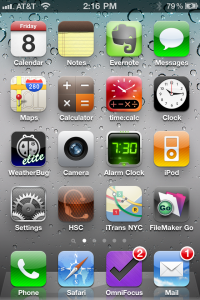
You know how on iOS you can put a bookmark on your homepage? By default it seems to take a clipping of the screen to create an icon representative of the site. I’ve noticed that some fancy sites (Google sites come to mind) actually generate a specific icon that makes it look more like an app, and well, just more attractive.

Today I found an article that explains just how simple it is to add an image to your site, so that when people add it to their home screen in iOS it looks clean and professional.

The article goes into detail about how to have different icons for the three sizes currently supported by iOS devices (low-res, iPad and Retina displays), and how to assign different icons for different pages of your site, but if you’re OK with letting iOS scale the icon down for you, and only need one image for your whole site, it’s stupidly simple. Check this out:

  • Make your desired image 114×114. You do not need to add any fancy shine effects or curved edges, iOS will do this for you, because as I said, it’s stupidly simple. Mine looks like this. As I already have several icon-sized site logos for use in various things, it took me about 5 seconds to generate the proper image.
  • Save your image as apple-touch-icon.png
  • Upload this file into the main directory of your site. For example, the URL for my image is http://headsetchatter.com/apple-touch-icon.png.

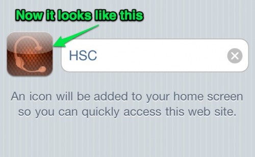
That’s it. Now instead of seeing something like this:
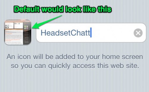
Your readers can see this:

For end users

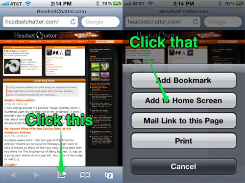
If you’re wondering how to add web sites such as this one to your home screen, open the site in Safari and follow this handy illustration:

January 1, 2010

New Year Site Updates

I call this: tech,web — Posted by KP @ 9:54 pm

Today I took some time to update some little things that have been bugging me about the site.

I have wanted to make the comment feature on the blog more welcoming for a while. For one thing, I have removed the need to register for the site before posting. I activated that because I was getting a lot of spam comments, but I will try again and see if it’s ok. Also, the comment section should support Gravatars (a service that will show your avatar on any enabled site based on the email address you post with). I would very much appreciate some feedback from other Gravatar users on if it works.

I also added support for threaded comments, and edited my theme to make the displayed comments and the new comment form stand out a bit with different-colored boxes. If you want to really see it in action, you can check out this post, which has a couple comments already.

In other news, I cleaned up some of the margins to allow for more consistent and attractive spacing between paragraphs and headings (on the blog and the main site), and fixed what was broke with image alignment with a recent WordPress update (hint: the needed CSS code was correct, it was just apparently too far down in the file, and moving it to the top was what fixed it — not exactly sure why, and don’t really care now that it’s fixed).

I’m also currently in the middle of updating all the posts with tags. I’ve never been one to use tags, but it seems like a good idea, especially given how many posts I have accumulated over the years. In the process, I moved the tags listing to the bottom of the post, where it seems more logical to me, in terms of where people will be looking when they decide they may wish to read more about the topic. My recent studies in PHP have made me a little more confident in editing my WordPress files. I may not always understand exactly what they do, but I’ve gotten pretty good at figuring out roughly what does what.

If you’d like to take a moment to play around with the comment features, please do! I’d love to hear from you!


December 25, 2009

Christmas Coding

I call this: computers,phones,tech — Posted by KP @ 6:59 pm

It’s been a really long time since I had the time to learn anything new about web development. The next thing on my list has been to learn more PHP so I can learn how to write scripts and generate dynamic content on the site.

I had an idea months ago for an online quiz I wanted to put on the site: I kept reading about iPhone apps where the title of the app gave little indication of what the purpose of the app was. Some of them were actually kind of funny (and by funny, of course I mean “could potentially be raunchy”). I had visions of a quiz which would present the title of an app and the user would have to guess from several descriptions of what the app was for. My only problem is that I didn’t know any programming languages to allow me to create such a quiz from scratch.

So today, Christmas Day, after a video chat with my family, I set about learning some more PHP (like all my coding knowledge, I don’t have any fancy books, I just type “php tutorial” into Google and see what comes up). I have gained some new knowledge, and I present to you:

The iPhone App Name Quiz!

Once I got used to the syntax, things came easily. Between my work on spreadsheets as part of my very nerdy involvement in the high command of Battleground Europe, and the stage management database I’ve been designing for the last four months or so, I have been spending a lot more time dealing with calculations and logic formulas. The last programming I successfully did before this year was in BASIC, back when I was in gifted camp when I was ten, so I am happy to find that my brain is retaining things and having an easier time working with concepts like if/then/else statements.

I’m not sure what else I’ll want to do with this newfound knowledge, but now I will have one more trick up my sleeve while adding to the site.


October 31, 2009

Site Updates

I call this: tech — Posted by KP @ 4:54 am

You’ll see some changes to the layout happened overnight.

Dear IE6 Users: I hope you’re both happier now

It started out with me wanting to make the site look just a tiny bit better in IE6. Our computer at the office has it, which has given me an opportunity to see just how craptastic it is. IE6 users make up 1% of my traffic, so I’m not willing to compromise too much — make that at all — but I wanted to fix any glaring mistakes.

One thing is that my resume was illegible because IE6 doesn’t take kindly to being given font sizes in percentages. By switching to pixels everybody’s happy, and now some producer with an old computer who doesn’t know how to download Firefox can read my resume.

The other major ugliness is that IE6 doesn’t support transparency in PNG images. It does support transparent GIFs, but GIFs are naturally lower quality. I tried to save the logo as a GIF and it looked awful around the edges. I felt I had tried. But tonight, I decided to try again, and when I cheated by using the matte feature in Photoshop to tell it what color the edges should blend into (I chose my favorite gray, #333333, which blends quite well with the carbon fiber background), it actually looked basically the same as the PNG. And the file size is a third of the original. So now IE6 users will see the nice clean lines of the logo and the bullet points.

OK so how do I know this? I found a nice little program called MultipleIE. It’s a Windows-based program that only runs on XP. It automatically installs a copy of whatever old version(s) of IE you want, from 3.0 to 6.0, and does not interfere with whatever newer version you have. I run Windows virtually in Parallels, so it’s easy to flip between coding on the Mac and checking Safari, and then checking how it looks in Windows.

I still have some more little ugliness to address (some of it in IE8 as well), which I will look into some other time when it’s not 5AM on a matinee day.

Warning: More Geek Speak Ahead

This morning I was reading about CSS3 and HTML5, both web standards that are all new and fancy and not yet completely supported by even the most current browsers. But I found it interesting to think that I could start playing around with some of these features, so long as they don’t make the site look bad in older browsers.

The biggest thing I played with tonight is the idea of curved boxes. I’ve always wanted curved boxes, but my philosophy with this site is that I want it to be flexible and code-based, and not wrestled into looking pretty with a bunch of images strung together that only look good in one size window.

However, using the CSS3 properties -moz-border-radius and -webkit-border-radius (for Mozilla and Webkit-based browsers, naturally), you can specify the radius in pixels (I used 10). There are also ways to add curves to each corner individually. This is the page where I learned about it. The best part of all this is that if you’re using Firefox or Safari, the site will look really cool. If you’re using something else, it will just look rectangular instead of curvy, which is not as cool, but still not bad. It doesn’t punish people for having an older browser, it’s just an added bonus for those who do. That’s why I’ve always had text shadows, and have stuck to color combinations that are still legible without the shadow.


October 13, 2009

Geeking Out About Color

I call this: computers — Posted by KP @ 2:29 pm

I’ve been kind of obsessed with color since I started web design.

Picking the colors for the new site was a huge mental undertaking, and I think I’ve got something I’m kinda happy with for now. Let me introduce you to my colors:

#FF4F03 This is the primary color used on the site. Let’s just say I have the hex code memorized. It’s the link color, and the navbar and most orange things are based off of it in some way. That picture of the tech table on the front page is tinted with this color. It’s kind of everywhere.
                           #F02311 This red is used very sparingly, on the line that divides the main content from the sidebar, and as the text shadow and underline for the H3 headings. The most interesting thing about this color is that on colourlovers.com it has been named as “Sex on the Floor”.
#FB8400 This orange carried over from the old site, kind of by accident. I had finished the site but was still unhappy with the colors I chose for the H2 heading. When I was updating the blog colors it looked so much better than what I was about to replace it with that I kept it.
#666666 I like grays a lot. I also like grays that have hex codes that are easy to remember. You will see this is a pattern. This is my default medium gray, it’s also used on the H1 headings.
#333333 This is my favorite gray. It was used a lot on the old site. All the “black” text on the site is actually this color.
#4D4D4D This one is my 2nd-favorite gray. It’s around here and there, mostly for text. It’s most prominent as the H3 heading (with that “Sex on the Floor” color as text shadow).
#F6F6F6 This was a new one for me. It’s only used on the front page for the box that I call “topfeatures.” That box used to be a darker color but when I used the orange mentioned above for the headings it looked muddy, so I needed something that was not quite white but would allow the headings to pop.

As I mentioned, I use ColourLovers.com to find new interesting color combinations and to play with palettes. It’s a cool site.


Grand Opening!

I call this: random — Posted by KP @ 12:32 am

balloonsIt’s time for HeadsetChatter.com to be unleashed on the world! The dust has been cleaned up from the site redesign, and pages have been added and updated.

Tell your friends, tell your enemies!

Don’t forget to follow @headsetchatter on Twitter!


October 2, 2009

Headset Chatter. Dot Com.

I call this: random — Posted by KP @ 12:32 pm

More big changes are on the way for the site. Last night I bought a domain name. First, I need to apologize to the long-time readers of this blog — I hate changing phone numbers, email addresses, etc, so I don’t like to make people change their bookmarks. But I need to preface this by saying that I never wanted to call the site, or the blog for that matter, “The Go Button.” The problem has always been that the .com was not available. It’s the site of some wifi finder app. What that has to do with go buttons, I don’t know, but nevertheless, the internet is a “finder’s keepers” world, and somebody else found it first. If thegobutton.com had been available, I would have bought it years ago when the blog was still hosted on Blogger.

This past May, I had two weeks off between jobs, and during a feverish four days I learned to code HTML, decided to expand the blog into a full site, hand-coded the whole thing, and launched the new site at thegobutton.net. I did take some time trying to come up with a better name before buying a .net domain, but nothing was good enough, and anything that was was already taken. So I decided that since I had to pick something, I would stick with The Go Button identity even though it’s a pretty terrible idea long-term not to have a .com. My hope was to come up with a better domain name in the first 3-6 months, and get the transition over with quickly before I had built up a lot of long-time readers, and before the GoogleBot got all comfortable with indexing the site. This summer I spent many days sitting on the couch in front of my full-height windows at my apartment at Reagle, just daydreaming and hoping that inspiration would come if I put myself in a relaxing situation. Some ideas did come, but for various reasons they weren’t good enough.

Last night on the Slow Boat to Washington Heights (otherwise known as the A train at 1AM), I decided to use the time to think more about possible names, or at least better logos for the current site. I was thinking that in 13 years working for Dewynters Advertising I should have absorbed more about proper logo design and branding. If you haven’t heard of Dewynters, they’re a British ad agency that has done some logos for theatre. If you know what this

or this

is, that’s because of Dewynters. They know a thing or two about logos. So I started to think, if Dewynters was designing a logo for a musical called The Go Button, about stage managers who talk about stage management and computers (an excellent idea for a musical if I do say so myself), where would they begin?

Finally I had no choice but to drag out these archaic tools called pencil and paper, and began making sketches of logos for The Go Button. Some of them might actually have been nice. But I let my mind keep wandering about images that are iconic to stage management, and came back to the headset (which I already use on the back of my business card, shown here:)

And almost before my brain could think about it, my hand was writing on the paper, headsetchatter.com. Well that certainly sounded like a domain that was available, and while it doesn’t quite have the theatre / technology metaphor of a go button, it’s close, and also suggests a place for discussion and sharing of experiences and ideas, which is really what the site is about. Things said on the site might be the things discussed in typical headset chatter — anything from “how are you liking your new flashlight?” to “did everybody see that there’s a new Starbucks app for the iPhone?”

Once I had written those words, all work on the Go Button logo ceased, and I couldn’t wait to get off the train and buy the domain before some cybersquatter came to ruin my great idea. I was very happy to find it available, and for about $7, snatched it up. I also grabbed the Twitter and AIM accounts for it. In fact, you can go to headsetchatter.com right now, and well, nothing terribly exciting will happen, but it will drop you off at the front page of The Go Button.

So what does this mean for the site? Nothing, in the larger sense. The focus and content of the site will remain the same. Over the coming weeks (my show starts previews tonight, so I should have some more free time), I will quietly be building a rebranded version of the site in parallel to this one. I’m thinking the layout colors may change a little. If all goes well and this really seems like a good idea, eventually the headsetchatter address will be unlinked from The Go Button and will start pointing to the new site, once I need to start testing it online. And then someday thegobutton.net will take you to headsetchatter.com, until in May of 2010, it will probably be released into the vastness of the interwebs.

In all honesty, I plan to use my next day off to stock up on Monster drinks and Mountain Dew, order a pizza, and spend like 18 hours straight working on this. So when I say “someday” it might actually mean “overnight.” It will happen when it’s ready. And once again I apologize in advance for making you change your bookmarks (I advise against doing it before the new site is launched), but I’m very happy that I think I have a web identity that will be more successful in the long term.


May 23, 2009

BIG ANNOUNCEMENT!

I call this: random — Posted by KP @ 5:53 pm

firstpage

Since I created this blog, I have long dreamed of having a full website where people would go for stage management tips, tricks, stories and downloads. I was held back only by my complete inability to properly design web pages.

A while back I purchased Macheist Bundle 3, which includes lots of fun software. One of the more popular apps is Espresso, which is a new app for web developers. While on tour I started feeling a little bit inadequate as a geek because I didn’t know any modern programming languages. So since I have this random free copy of Espresso, I thought I’d take some time to start out small and work my way through hand-coding websites in HTML, CSS, and onward from there. With nothing but free time between the tour and the Reagle season, in just a few days I had progressed through HTML to basic and intermediate CSS, and I decided to go ahead and buy the domain I’ve had my eye on for over two years, thegobutton.net (thegobutton.com, unfortunately, was taken, otherwise I probably would have bought it when I started this blog).

Along with that I purchased a hosting plan from godaddy.com, and uploaded the little site I developed onto it, and began expanding it. As of this writing, I have been working on this little project for three days, and I am ready to announce it on the blog. It’s very much a work in progress, there are a lot of placeholders, but if you’re curious to see what I’m working on, you can browse around, and there’s a forum that’s up and running, too (what I need a forum for at this point, I don’t know, but I like forums).

This blog will eventually move over there, as soon as I figure out exactly how to do that. In all likelihood I will install WordPress and transfer all the posts over.

And I promise, the banner will calm down. I needed to design a dummy one to get started, I had new Photoshop filters to play with, and things just kind of went from there.